DIFFA 2017 presented its annual Dining by Design in NYC along with the Architectural Digest Design Show. What a pair. HOBNOB absolutely loves attending this spectacle every year, and comes away delighted, amused, and impressed by what the designers come up with.
DIFFA (Design Industries Foundation Fighting AIDS) stages an amazing set of rooms every year, and this year happened to be the 20th Anniversary. In general, we saw lots of gold and brass, rich jewel tones, and a signature red, white and black color scheme in honor of the anniversary.
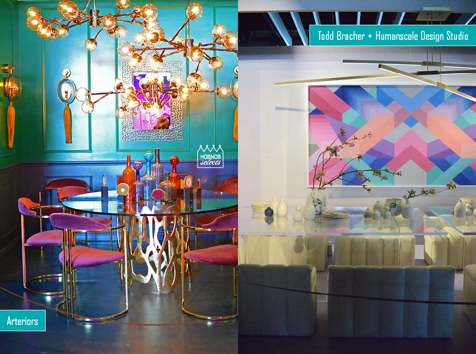
Arteriors: We loved the rich jewel tones that filled this space, with accents of gold, brass, and tasseled sconces. Super glam. (see the photo at the top of this post)
Todd Bracher + Humanscale Design Studio: A cool, pastel palate won our attention here. (see the photo at the top of this post)
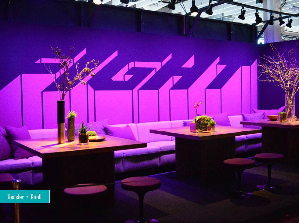
Gensler + Knoll: A bold statement surrounds this wonder in purple. Nice banquette and open minimalist stools create an inviting space. The word “FIGHT” was not immediately evident upon viewing the room, the letter form a sort of shadow, and the message appears secondary.
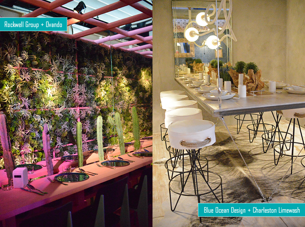
Rockwell Group + Ovando: A wall of strangely lit succulents are the backdrop to this peculiar setting. Cacti along the center might prevent meaningful discussions at this table!
Blue Ocean Design + Charleston Limewash: The highlight of this room are the nautical stools, with such personality.
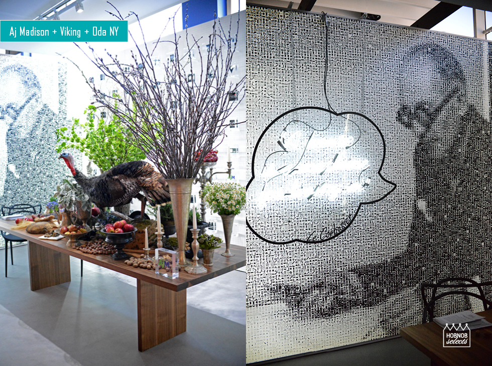
Aj Madison + Viking + Oda NY: A truly oddball and interesting assortment in this space. A cool, pointillist image of Le Courbousier graces one side of the room, with his quote in neon, “A house is a machine for living in.” The back wall housed a grid of black and white icons. The table, on the other hand, went very medieval, with a feast in the process. Loved the juxtapositioning of these two worlds.
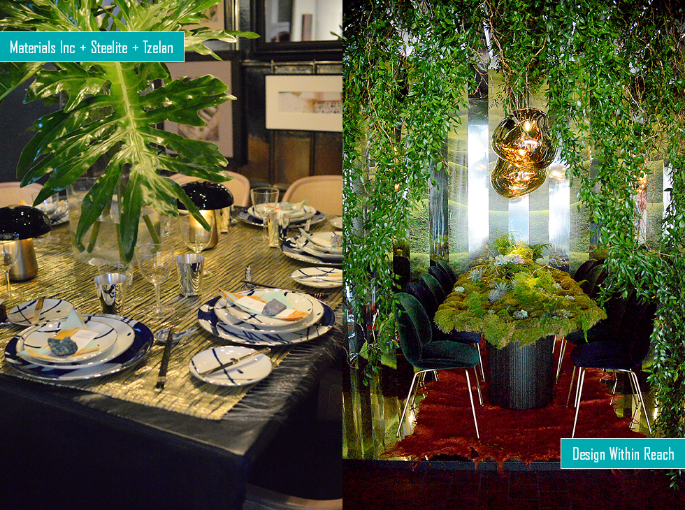
Materials Inc + Steelite + Tzelan: This space paired gold reflective walls and table surface with massive greenery and abstract plating.
Design Within Reach: DWR created a mossy wonderland, surrounded by mirrored walls. The lighting over the table added a lush, amorphic glam twist. Velvet chairs in a deep green were a perfect accompaniment.
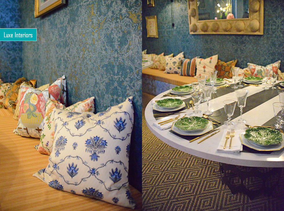
Luxe Interiors: Pattern on pattern was the statement here. A banquette with pillows enveloped the space, whose oversized round table graced one end, very asymettrically. Gold accents throughout tie it together.
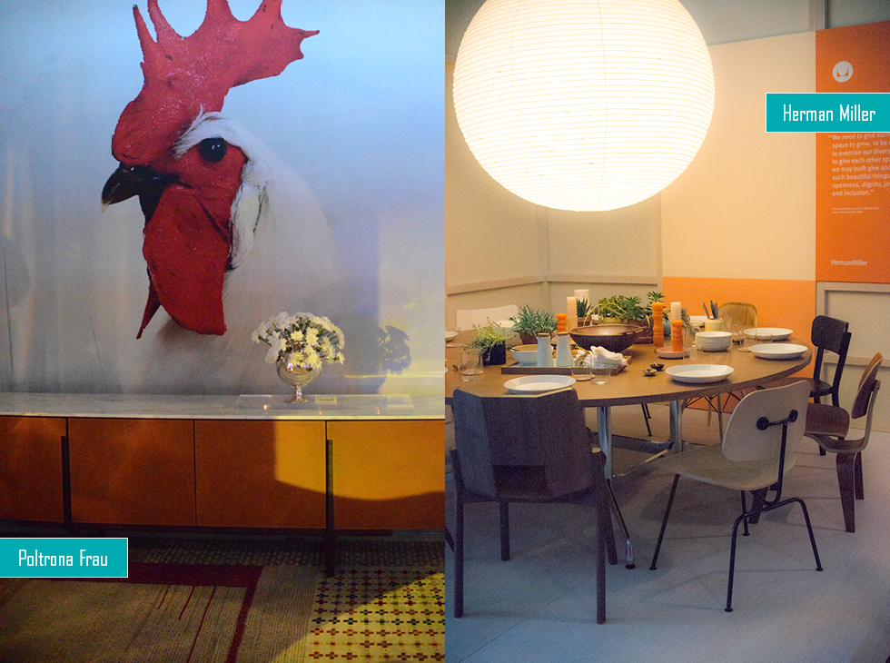
Poltrona Frau: Could this ve considered a breakfast room with way-larger-than-life rooster?
Herman Miller: A pure representation of all that is the brand. Simple, classic, understated.
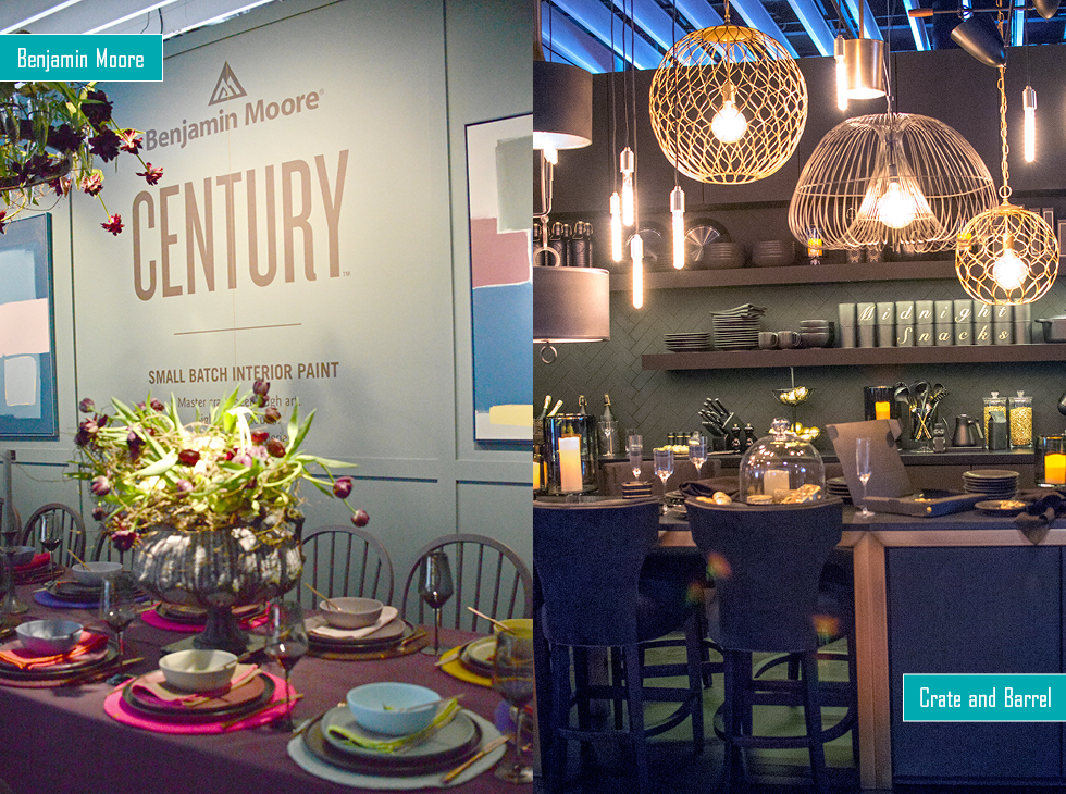
Benjamin Moore: The paint company showed off its new exclusive collection of small-batch colors reflected in the plating, tablecloth, and walls, for sophisticated tastes.
Crate and Barrel: This company showed off their goods in a fantasy kitchen bedecked with all the accoutrement you could ever require. Gold accents here too.
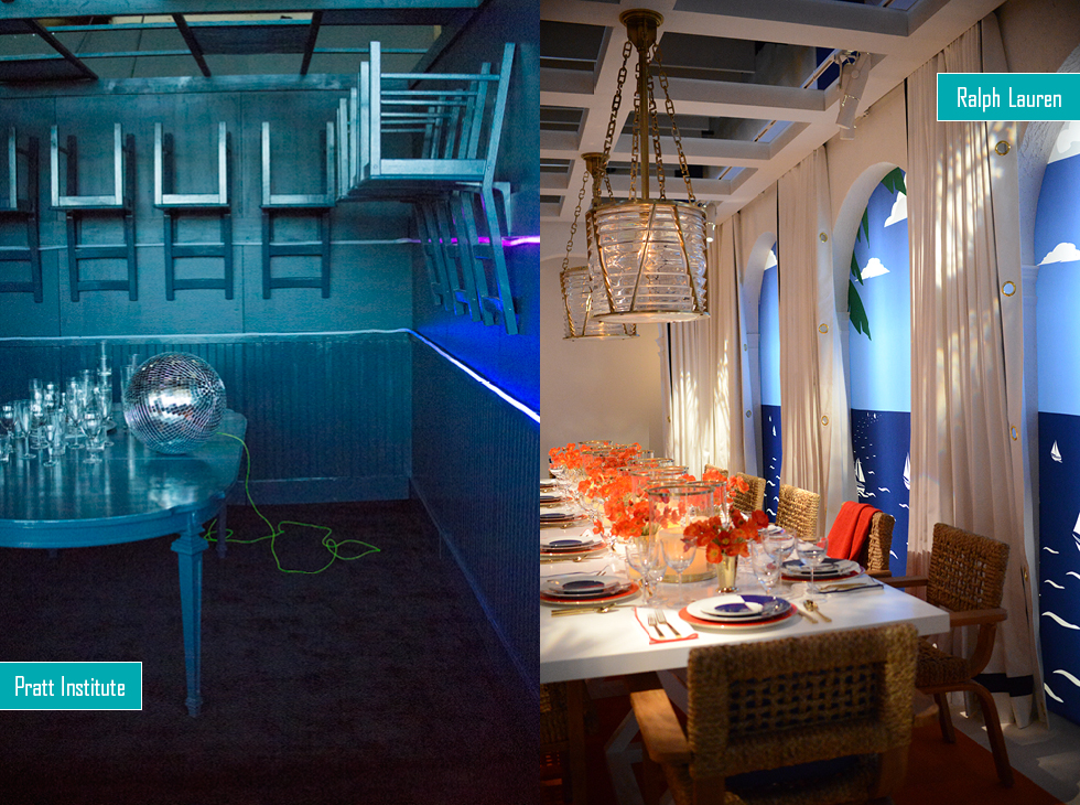
Pratt Institute: Surreal dining in a somber gray blue.
Ralph Lauren: A sunny and cheerful ocean scene almost as good as having an ocean view. Orange accents made for a lively contrast.
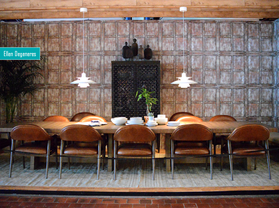
Ellen Degeneres: A masculine approach, almost office like, with plush leather chairs—all in tones of taupe, brown, wood.
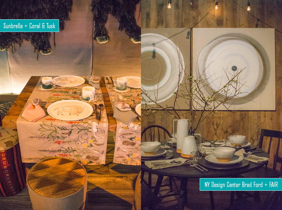
Sunbrella + Coral & Tusk: A safari theme and natural fabrics covered the room. Lovely embroidered table runners, set across the table made for nice place settings for two.
NY Design Center Brad Ford + FAIR: A woody, natural escape. Rustic tableware, and branches make a quiet statement.
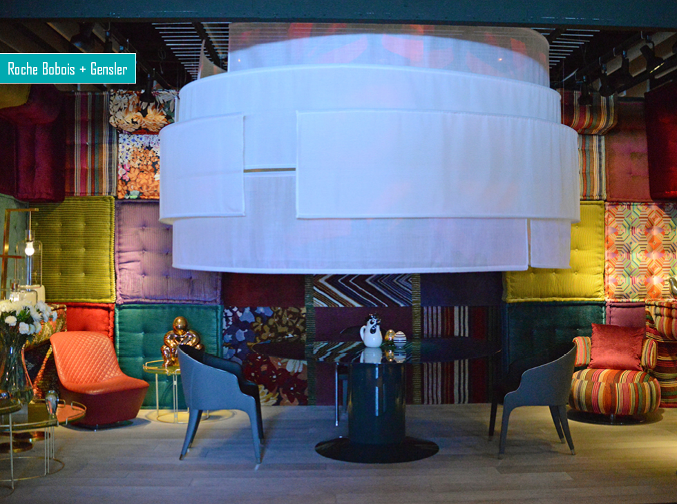
Roche Bobois + Gensler: If you had to be in a padded cell, this is the one you’d choose to be in—that is, if you like pattern. A patchwork of their lively upholstery, in jewel tones and vibrant yellows, rusts enliven the space designed for dining for two, under a dome of massive size.
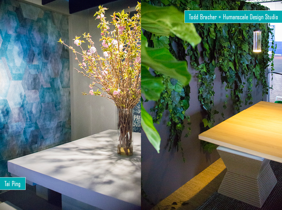
Tai Ping: White minimalist benches, and a simple centerpiece highlight rugs with serene patterns.
Todd Bracher + Humanscale Design Studio: Indoor/outdoor solution featuring foliage and a sleek table with sculptural base.
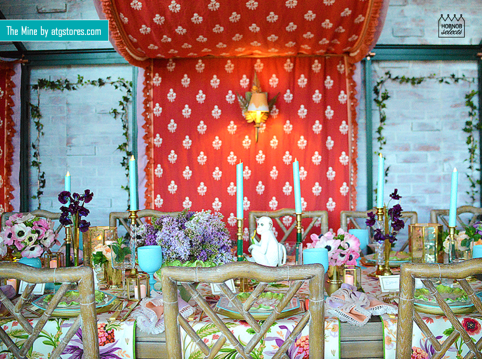
The Mine by atgstores.com: A space that was totally filled and dressed to the nines. Fabrics, trellises with foliage, lively floral displays—this is a room that takes an hour to dissect. A true escape from reality inside a lovely, Victorian, fantasy garden.
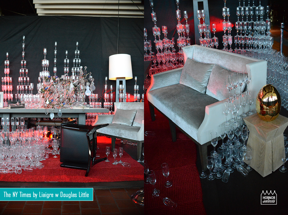
The NY Times by Liaigre with Douglas Little: A mind-blowing, abstract champagne-glass extravaganza. This room has a gorgeous simplicity and artsy installation, featuring a fallen chandelier and toppled chair—representing a party “gone mad.” We applaud the painstaking workmanship and theatrical presentation from Douglas Little.
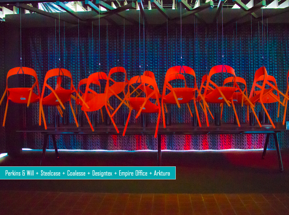
Perkins & Will + Steelcase + Coalesse + Designtex + Empire Office + Arktura: A weighted pulley system creating a centerpiece along the table, suspends chairs in this stark statement, titled “(re)action” encouraged interaction.
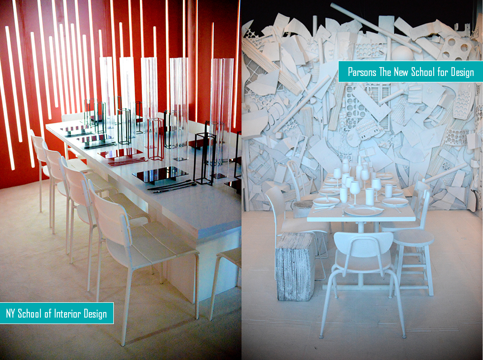
NY School of Interior Design: Using the traditional colors of DIFFA, this minimalist work plays with florescent tubes and vertical lines, which are echoed in the tableware and vases.
Parsons The New School for Design: Assembled from found objects all over NYC, the students took the money meant for props and gave it to charity, Vocal New York, who support low-income people with AIDS.
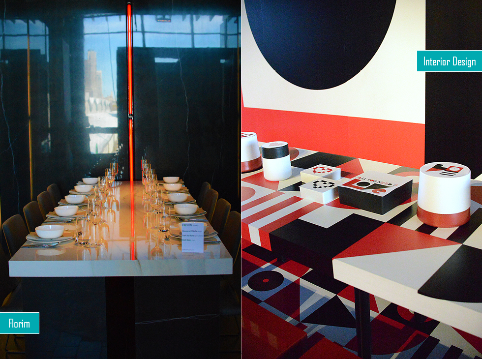
Florim: Also tying in to the official DIFFA color scheme, this dining room is done up in marble, with striking vertical accents in red and white. You miss the effect of this room, due to the reflections of the city in the walls, but it was quite a statement in person.
Interior Design: A message of love, and sharp graphics adorned Interior Design’s statement for this year. Cool cubic stools surround an immense table with the backdrop touting an abstract depiction of the word LOVE.
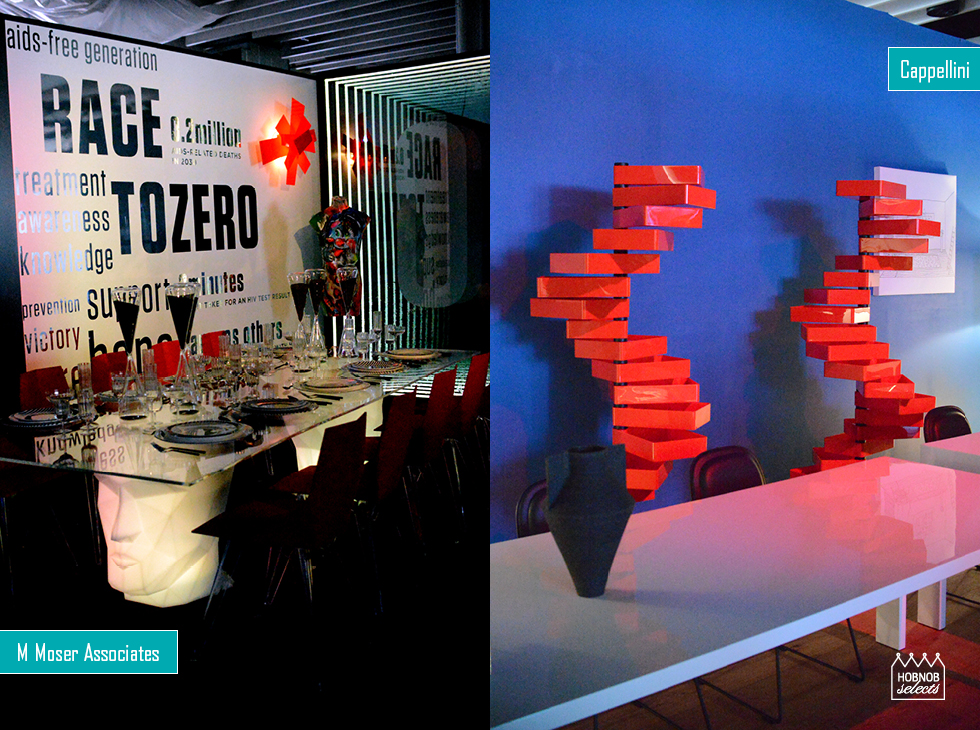
M Moser Associates: Red, white, and black make an appearance here too, with angular accents and cool table bases made with planters by Adan Planter.
Cappellini: One of HOBNOB’s favorite pieces of furniture grace this space times two, the revolving cabinet by Shiro Kuramata. It’s all you really need.

