Dining by Design takes place every year along side the Architectural Digest Design Show and showcases the imaginations of top designers. It’s presented by DIFFA (Design Industries Foundation Fighting AIDS) and stages an amazing set of rooms every year. We saw lots of brights with pink as a main accent color, some tricky illuminations, and bold choices.
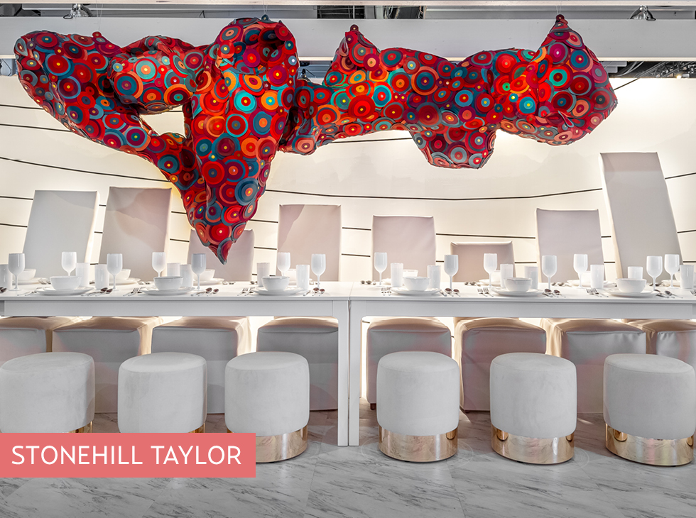
(photo at the top of this post) Stonehill Taylor provided a super-graphic design for Ultrafabrics, who provided the supple material for the abstract mobile. This fabric, which looks and feels like leather, is actually more durable, scratch-proof and comes in an astonishing range of colors. It really got me re-thinking leather.
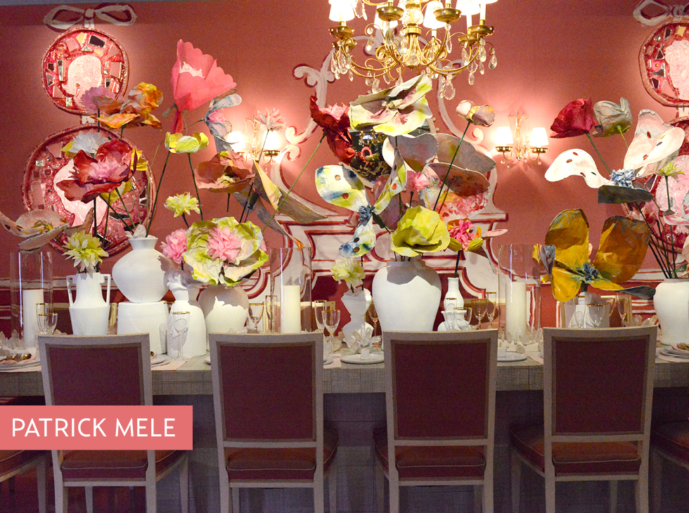
Patrick Mele provided a fanciful design for Benjamin Moore in shades of coral and pops of chartreuse.
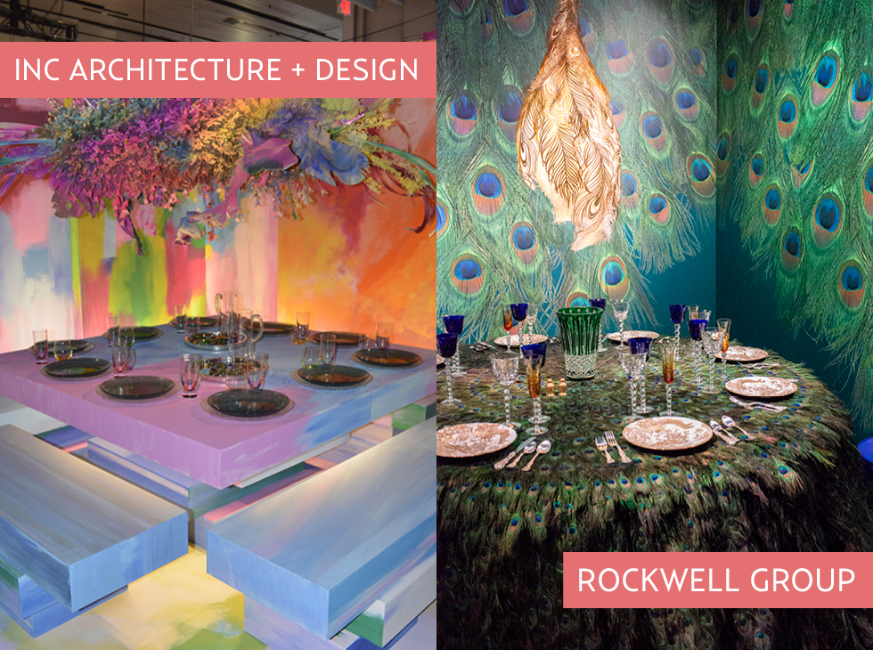
Inc Architecture and Design went with a rainbow of jewel tones and lit the table from below, to dramatic effect.
The Rockwell Group went nuts with a peacock theme. The table covering was made with actual feathers.
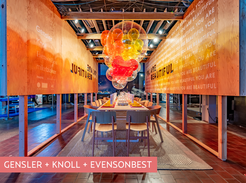
Gensler, Knoll, and Evensonbest projected the message “You Are Beautiful,” a celebratory reminder to all those individuals living with HIV/AIDS that they are beautiful both inside and out, that they deserve enduring happiness, and most importantly that they are not alone in their fight. The lighting featured colorful globes creating a party effect.
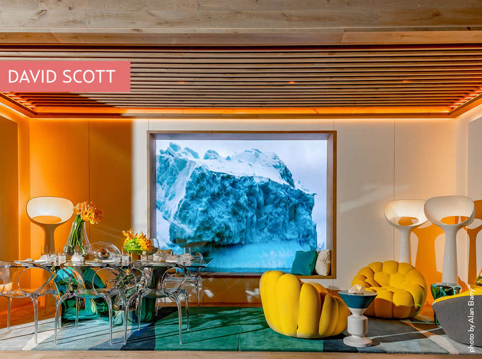
David Scott produced a bold and invigorating room with a video as the center star for Roche Bobois, meant to mimic a luxury liner cruising the Atlantic, which focused on a slow-mo gigantic iceberg.
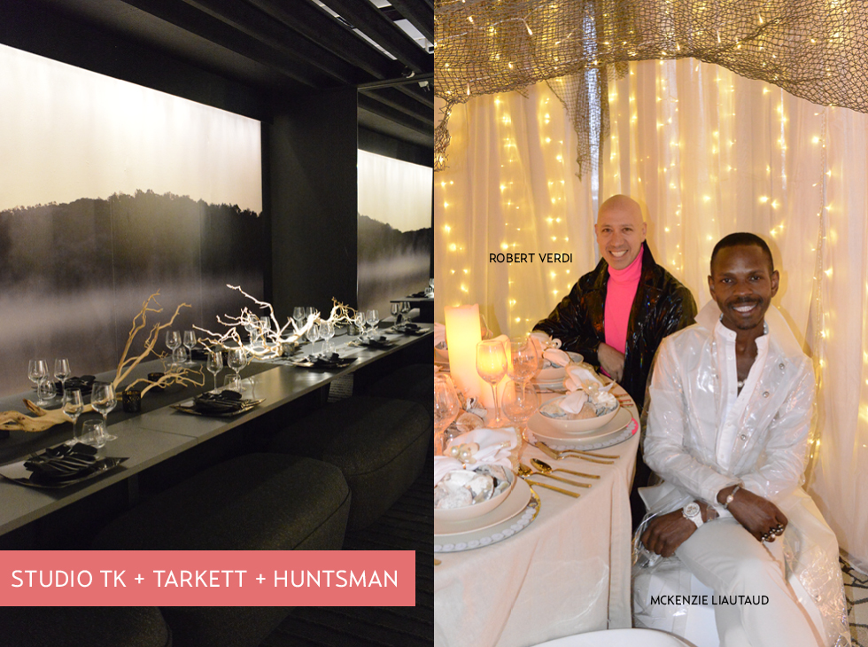
Studio TK + Tarkett + Huntsman collaborated on a minimalist, stark display mixing natural elements in a black on black setting.
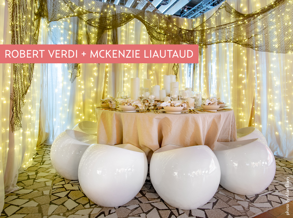
McKenzie Liautaud, a jewelry designer, + Robert Verdi tastemaker and TV personality, were inspired by a nautical theme: where the river meets the sea. They want you to marvel at the beauty of pearls and the creatures that create them. Pearl stools perch at a table set with silver and crystal beneath twinkling stars.
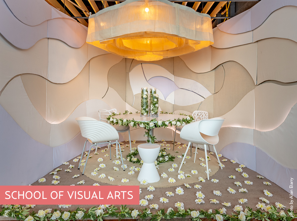
The School of Visual Arts went floral in this sweet display.
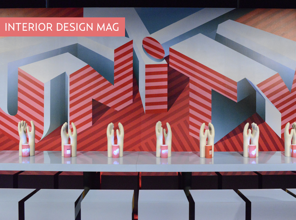
The show’s main sponsor, Interior Design Magazine, chose to use bold graphics and the inspiring message: “Together in Unity!”They want people to see the good in others and help those in need.
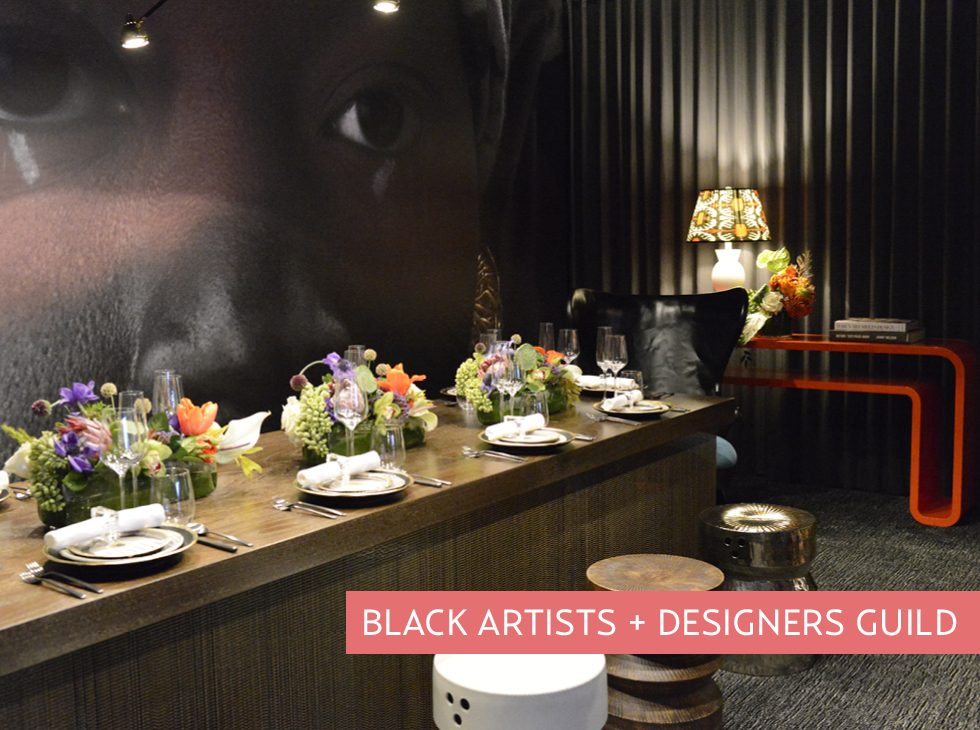
Black Artists + Designers Guild’s booth featured a super-blown-up face to represent: She, who carries the love and ruin of man in the belly of her eyes. If she is diminished the whole is compromised. The theme represents the silent hope binding us together.
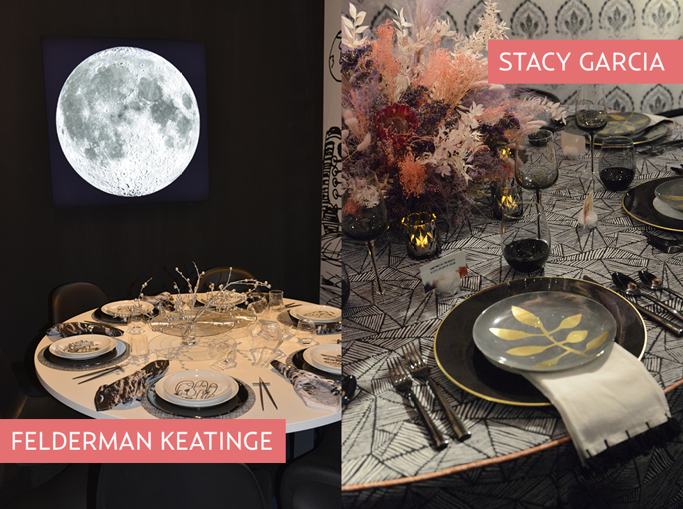
Felderman Keatinge + Associates celebrates the 50th anniversary of the first lunar landing symbolizin the human ability to dream infinitely and achieve greatly. “No Dream Is Too High,” —Buzz Aldrin, Astronaut.
Stacy Garcia mixes the soft, subdued tones of winter with the explosion of color that is spring. Designed in collaboration with Crypton Home Fabric & Calico. Florals in collaboration with Sahola Flower Fashion Boutique.
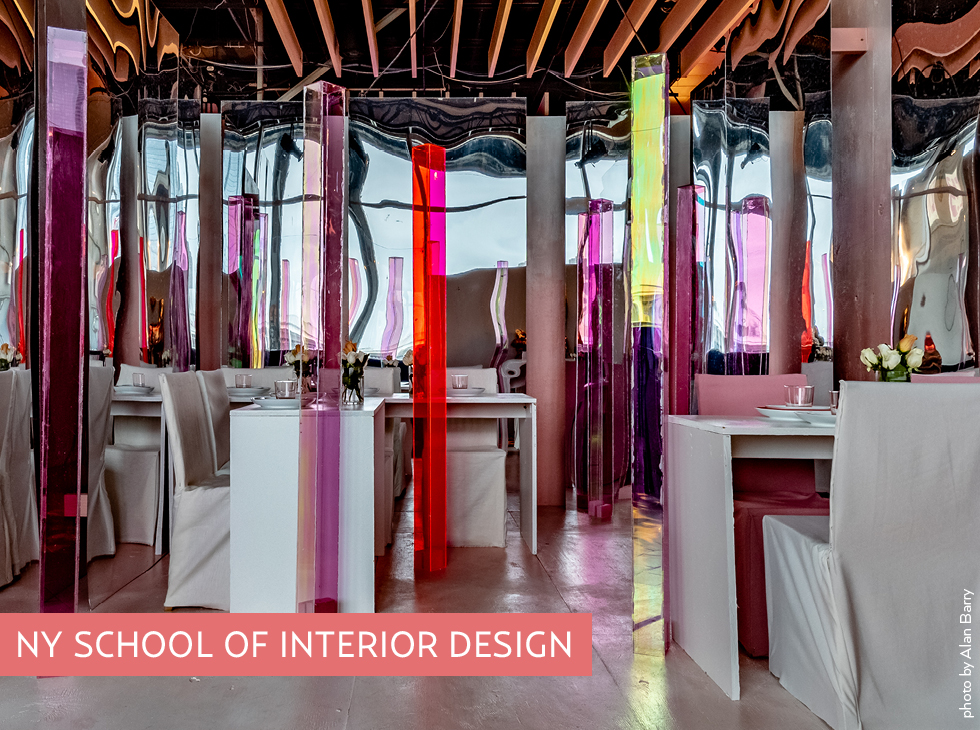
New York School of Interior Design uses infinity mirrors to enforce the abstract idea of perception and point of view, sculptures are mirrored endlessly.
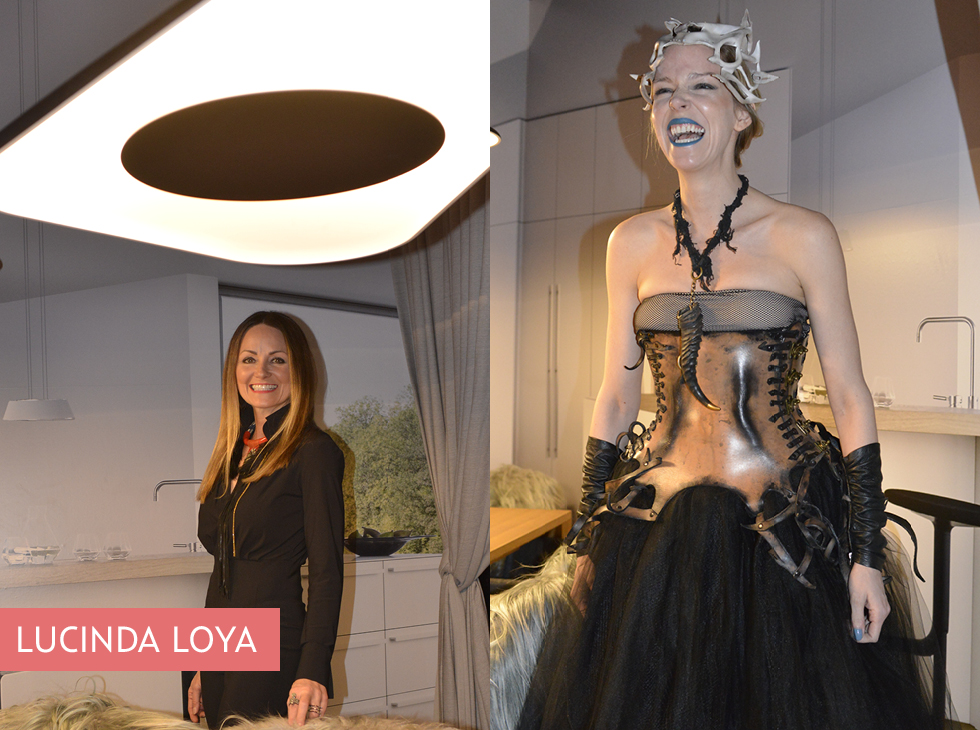
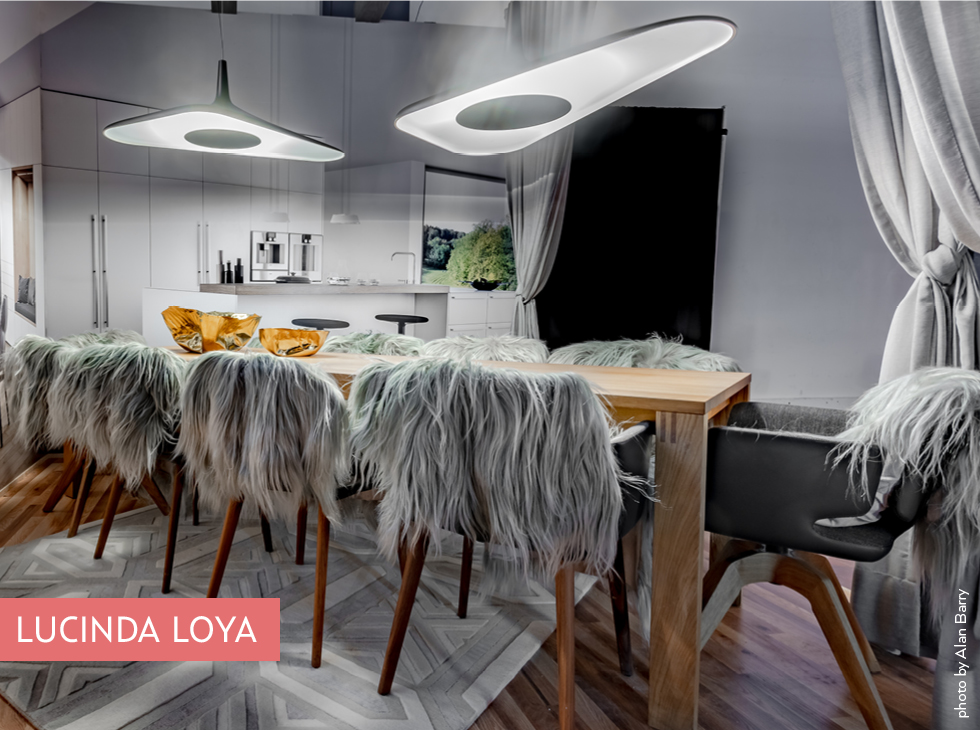
Lucinda Loya planted an opera singer in her booth to greet us as our group approached. The stunning kitchen expresses her passion for dining and entertaining with lush fur-lined seating in her collaboration with German Kitchen Center.
